.border-bottom
.border-top

The only thing that matters is the data your audience came for. Design, layouts, make-up and decorations are just your tools to highlight the value.
Imagine you have 30 secs to pitch your data. What would you say? What decision maker need to know? How would you present it? What would you highlight? What would you hide?
That's it. That's the only thing that matters. Delete the noise. Make your audience satisfied.
Actually, the most effective way to solve your problem
If you find a bug or have a feature request
To discuss a proper way or provide some feedback
The card is the narrative surface: an article preview, a person, a project, a pricing block — content an author made for a reader. A panel is for data; the rule for choosing between them is on the Building Blocks page.
Cards provide distinct content separation, letting you build complex hierarchies and group related elements. By default they stand out through background color, and they lay out as a flex column.
A card is a versatile connector piece — it takes on any visual style through utilities: sizes, colors, margins, paddings, alignment, borders. Content-wise it can be a simple container or develop its own hierarchy, holding any content type, blocks, or interactive elements.
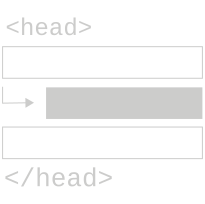
A card has no parts of its own: a fixed header, body and footer belong to the panel, which is for data. A card’s header is a block with .border-bottom and a padding utility, a footer one with .border-top.
Cards come in two default styles: .card and .card-inverted. Each is a surface: it paints its background from --surface-current, and a chart on it (RareCharts 0.9.8_7 and later) paints its label plates with the same colour. .card-inverted also re-maps the text, border and chart roles for its dark ground, so a panel divider or a chart on it reads (Surfaces). A .card nested in a .card-inverted is a light surface again: it takes back the page's values of those roles, a project's own on :root included.
Blocks that hang into the page margin (pre, blockquote, .lead, the caption widths) stay inside both cards, as in a panel. On paper a .card-inverted prints as a light card in a thin frame (Print).
When one card is not enough and the cards form a regular, repeated set, .card-grid is the special case that arranges .card-grid__item tiles into a responsive grid. It is the one place where the card surface owns its own layout, because the tiles are uniform by design. Column count defaults to five; the --cols-2 / --cols-3 / --cols-4 modifiers (or the --card-grid-cols custom property) set it; below desktop every variant collapses to two so tiles stay legible.
The grid ships two tile treatments. .card-grid--cards turns items into square card surfaces:
.card-grid--gallery turns items into image tiles — set the image with an inline background-image — with a title overlaid at the bottom:
The card grid is for uniform, repeated tiles. For a freeform arrangement of full .card surfaces, do not reach for a component — use the grid utilities directly, as shown next.
There is no .card-deck selector, and there never needs to be. A “card deck” is not a thing the library ships; it is just several cards arranged together, and arrangement is already a solved problem. Any block-level element — a <div>, a <section>, or another .card — can serve as the wrapper, and the alignment, positioning, spacing, and grid utilities do the placement.

This block is a .card-inverted wrapping an image, a header, prose, and a nested card — no special deck class involved.
Cards are standard block elements capable of holding any content type: text, images, charts, tables, or interactive elements.
.card-inverted
The takeaway: any positioning a card layout needs is reachable through the existing utilities. Before adding a new class, check whether alignment and positioning already cover it — they almost always do.
The same principle, pushed further. Everything below is built from cards plus decoration, color, spacing, and positioning utilities — no bespoke classes. Combine them freely to satisfy virtually any design requirement.
.rounded
.circle
.shadow
.card-hover
No catch. Well, one: it’s a demo.
Was $999, now $0. We did the math twice.
Hurry! Only ∞ left in stock.
.bordered
Not a single new style went into this section. The confetti, the stamp and the poster itself are cards plus the existing decoration, color, spacing, positioning and typography utilities, with stock components on top: .button-primary, .tag, .callout, and plain <mark> and <s>. No inline styles, no one-off classes: open the markup and every class in it is documented in the library.