
So here is a fair question: what happens when you point Rare Styles at something loud? A car-painting shop in Dubai — a black-red-and-yellow brand that wants to shout. No prose column, no muted palette. Nothing this library calls home.
That is exactly why it is a good test. A narrow, opinionated CSS library earns its keep when it holds up off its home turf — when it carries the boring structural weight while you paint something that looks nothing like the docs.
Let's build the landing and find out where the seams are.
The brief
The designers hand over a single mockup — the whole page, top to bottom.
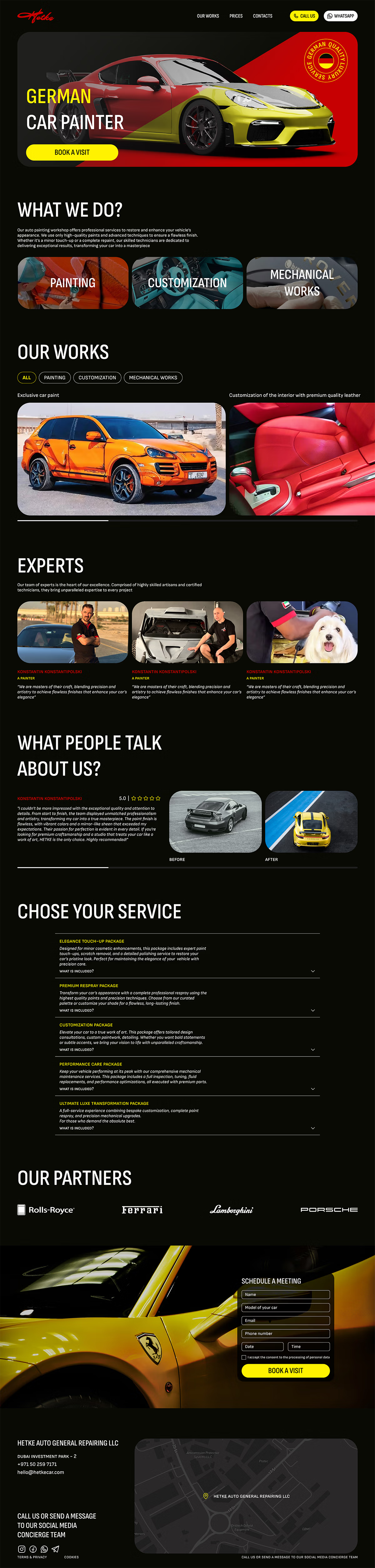
The classic handoff: a dark, brand-forward landing with a hero, service tiles, work galleries, a team, testimonials, a service menu, partners, and a booking form.
Looks like a lot. It isn’t. Scroll it once and the same half-dozen shapes keep coming back.
Reading the mockup
Squint past the paint and the page is structurally plain:
- Stacked sections — a hero, then heading-plus-content bands all the way down.
- A three-up tile grid — the services (Painting · Customization · Mechanical), and again for the experts.
- Horizontal-scroll strips — the works gallery and the partner logos run off the right edge instead of wrapping.
- A map, a form, an accordion — the long tail.
Every one of those is a shape Rare Styles already ships. The grid is .grid + .grid-cols-*. The scroll strip is .feature-row. The map is .iframe-video. So the plan is not to fight the library — it is to let it carry the skeleton and paint our own skin on top.
Get that division right and the loud design costs almost nothing structurally.
Step 1 — Wire up the library, then a skin of our own
Two stylesheets. The library first, a local hetke.css second — so when the two disagree, ours wins on load order.
<link rel="stylesheet" href="https://cdn.jsdelivr.net/gh/raredigits/rare-styles@latest/rare.min.css">
<link rel="stylesheet" href="/assets/css/hetke.css">
...
<body class="hetke">
The class="hetke" on <body> is the whole trick behind the skin. Rare Styles themes bare elements — body, header, section, h1, a — because on its home turf it owns the page. On someone else's page that is presumptuous, so every rule we write is scoped under .hetke and wins by specificity, without patching the library itself.
Step 2 — Re-point the tokens
Before a single section is built, re-point what repeats. Brand colours and display fonts become tokens; the page-level defaults get re-themed once.
.hetke {
    --hetke-yellow: #f9d50b;
    --hetke-red:    #c70001;
    --hetke-ink:    #fff;
    --hetke-bg:     #000;
}

body.hetke {
    color: var(--hetke-ink);
    background: var(--hetke-bg) url('img/background.svg');
    font-family: "Sofia Sans", sans-serif;
}

.hetke h1, .hetke h2 {
    font-family: "Unbounded", sans-serif;
    text-transform: uppercase;
}

/* One rule sets the rhythm for every section on the page. */
.hetke section { padding: 30px 0 40px 40px; }
Because the library themes bare elements, a few dozen lines re-skin the entire page at once — black canvas, white ink, the display face on every heading. We never touched a component to do it.
Step 3 — Assemble, then tune
Now the page is mostly composition. The three service tiles are a grid; each tile is our skin.
<div class="grid grid-cols-3 mobile:grid-cols-1">
    <div class="serviceItem servicePainting">Paintings</div>
    <div class="serviceItem serviceCustomization">Customization</div>
    <div class="serviceItem serviceMechanical">Mechanical Works</div>
</div>
The works gallery is the same move sideways — a .feature-row that scrolls instead of wrapping:
<div class="feature-row">
    <div class="feature-row__item">
        <p>Exclusive car paint design</p>
        <div class="workImg workCayene"></div>
    </div>
    <!-- …more items scroll off the right edge -->
</div>
.grid-cols-3 collapses to one column on mobile with mobile:grid-cols-1; .feature-row keeps its horizontal scroll on every width. Two library classes, zero media queries written by us.
The hero is the exception, and it always is. An absolutely-positioned headline over a full-bleed photo with a corner stamp is bespoke by nature — no library should have an opinion about it, so it's hand-built in hetke.css and left alone.
Tuning the library to our tokens
The interesting part is the friction — the handful of places where the library's defaults, written for a document, meet a design that isn't one. Two examples worth keeping.
An inline icon inside a button. The library sets img { display: block } — correct for content images, wrong for a phone glyph that has to sit inside a "Call us" label. Left alone, the glyph drops onto its own line and the <nobr> can't save it. One override puts it back inline:
.hetke .icon { display: inline-block; vertical-align: middle; }
A header the library wants to theme. header, nav and .button all arrive pre-styled for the docs chrome. Our dark bar re-points them under .hetke — vertically centring the nav, and sizing the CTA pills to their content plus padding instead of letting them stretch:
.hetke .headerWrapper { align-items: center; }
.hetke nav ul        { align-items: center; }
.hetke nav .button   { padding: 6px 15px; }   /* content + padding, not stretched */
That is the honest cost of embedding today: the base layer assumes it owns the page, so you re-point it where it clashes. It is also exactly the assumption the library is scheduled to make opt-in — at which point this section gets shorter.
Paint the skin yourself.
Touch the base only where the library's page-level assumptions get in the way — which, for now, is the header and one stubborn icon.
The result
Same mockup, built on the library: open the finished landing →
The skeleton — every grid, every scroll strip, the map — came from Rare Styles. hetke.css is only the skin: the black canvas, the yellow, the display type, the hero, and the few base rules we re-pointed to fit. That is the split the library is aiming for as a default — structure you inherit, skin you own — proved out on a design that is about as far from a longread as a page can get.